Project: Snookies™ - Delicious, bite-sized cookies baked with happiness.
Challenge: Develop a brand identity and packaging design for Snookies that captures their mission of spreading smiles through delicious cookies.
Solution:
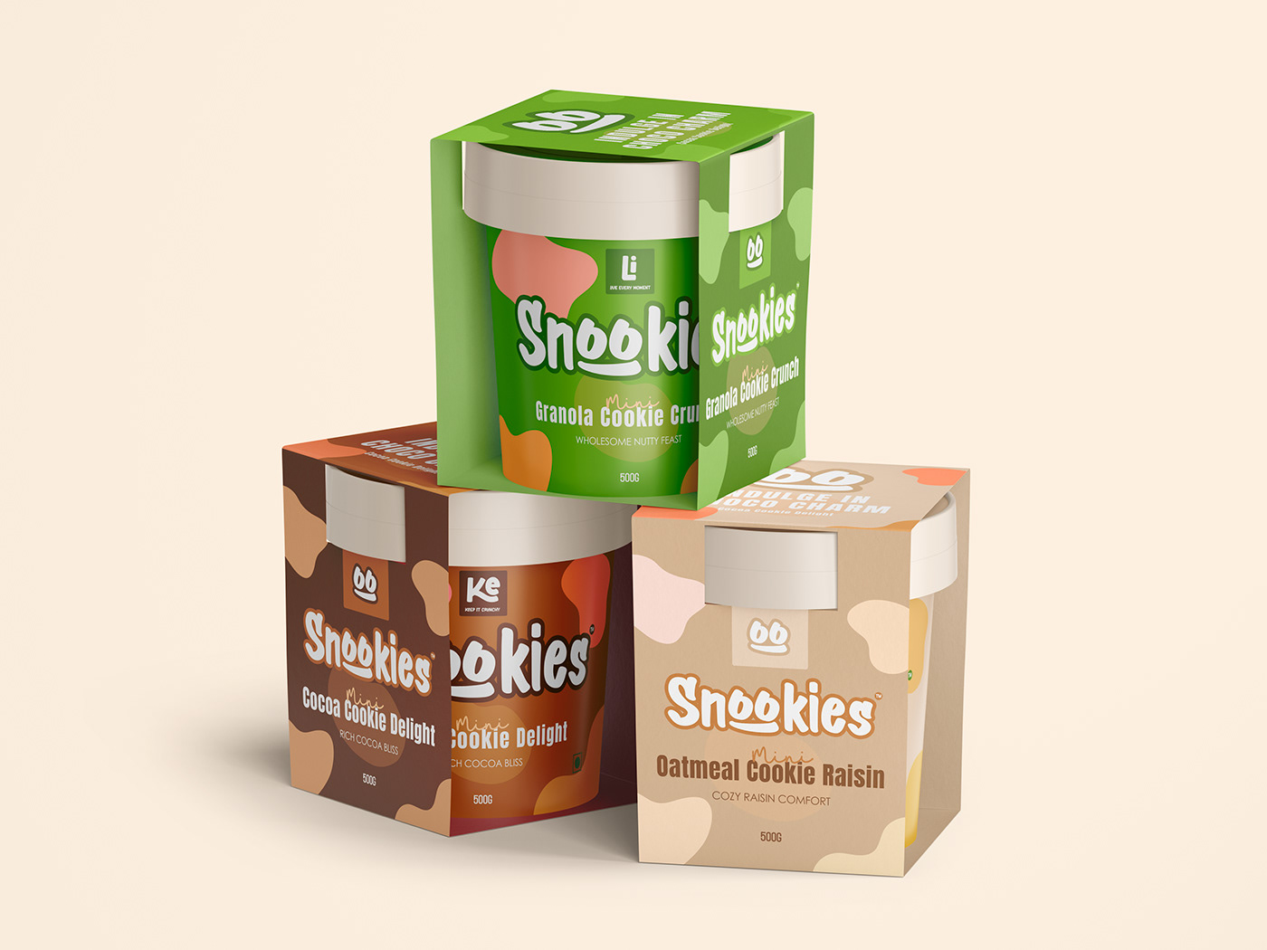
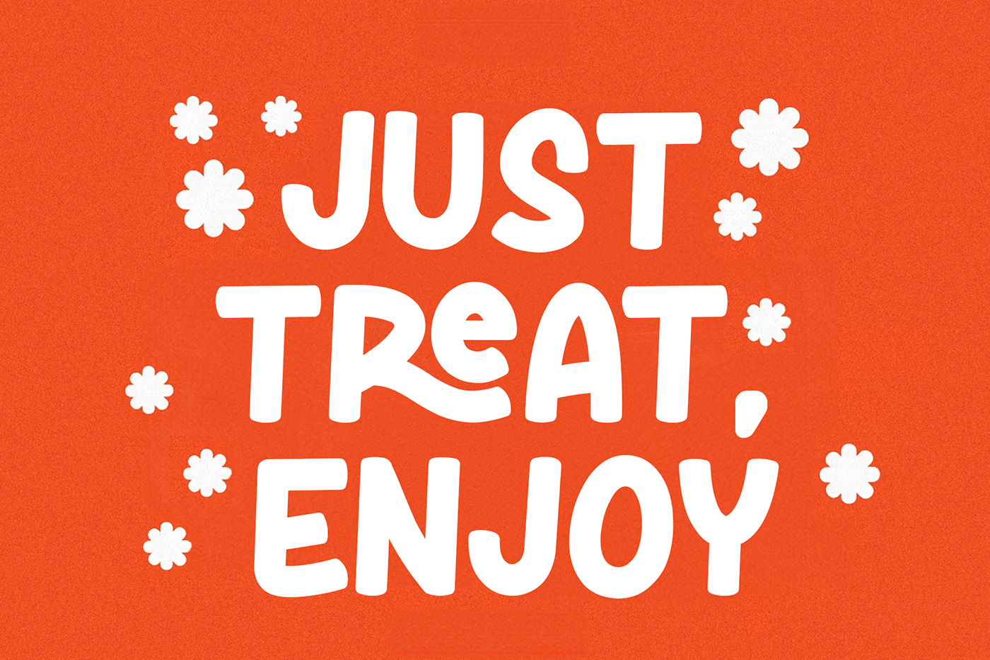
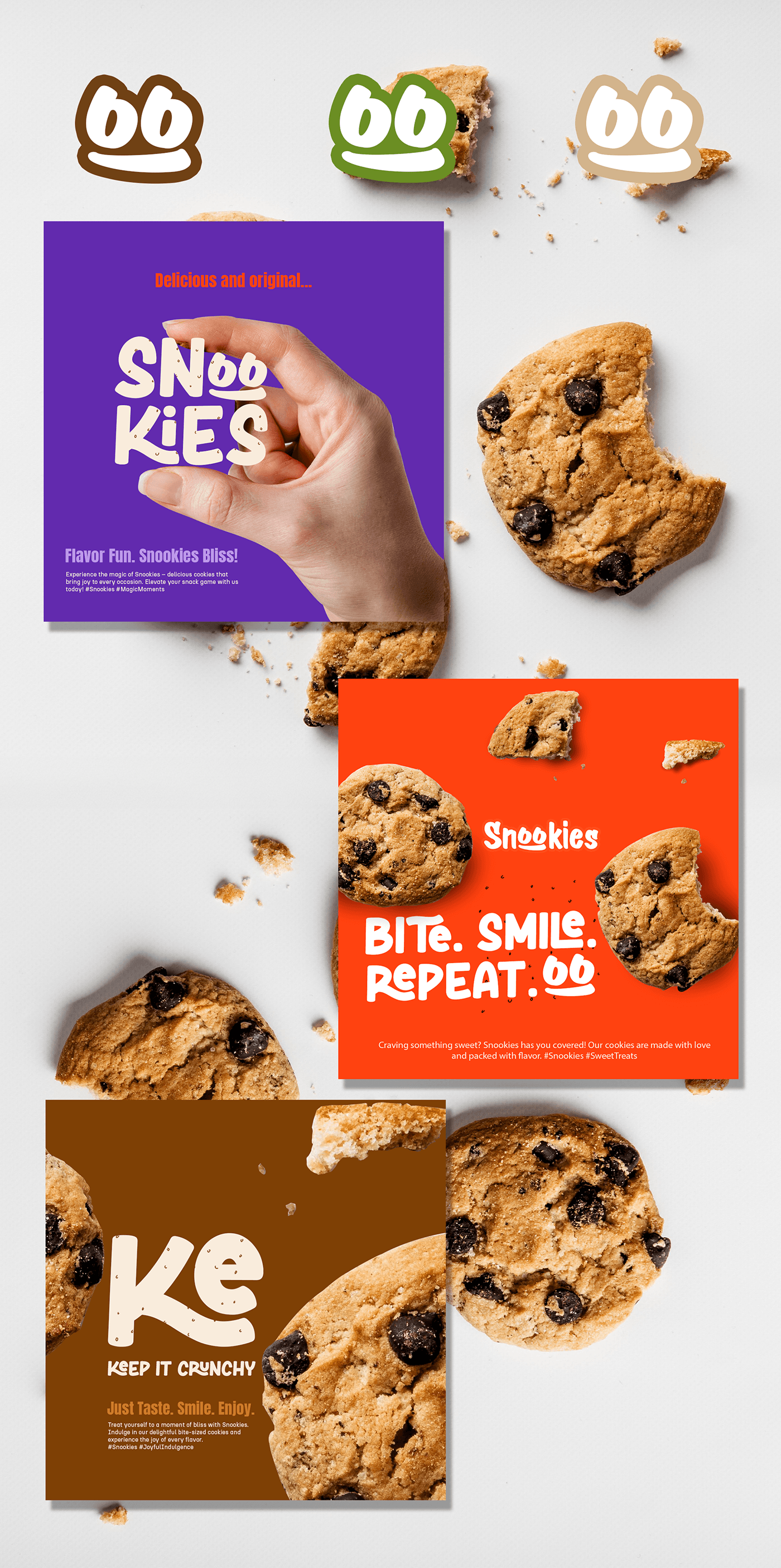
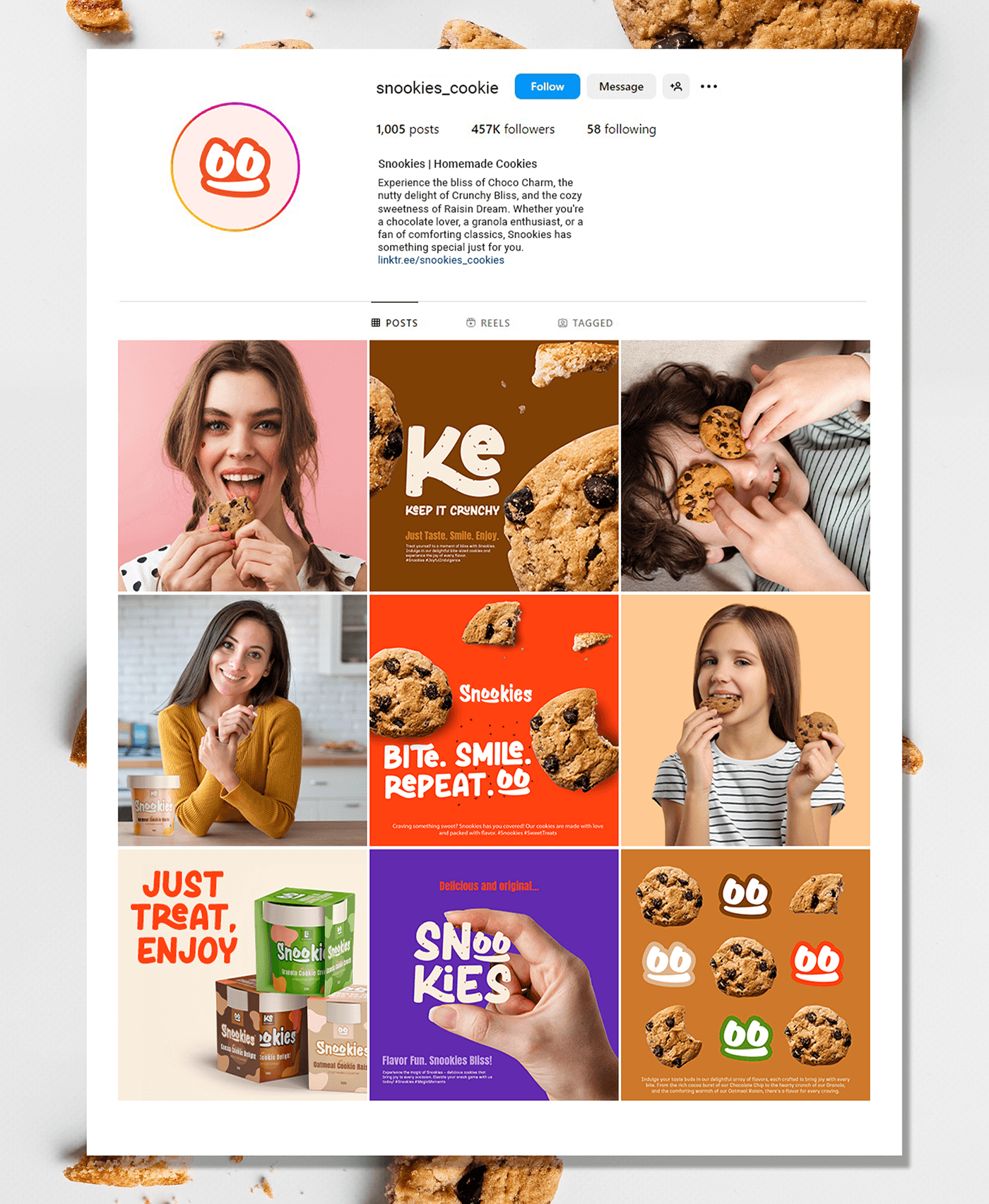
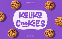
Logo: A playful font featuring a double "oo" that resembles a wide grin, reflecting the joy Snookies brings.
Color Palette: Vibrant and cheerful colors reflecting the fun and friendly nature of the brand.
Packaging Design: The genius of Snookies lies in their innovative packaging. Ditch the traditional bag! Snookies offers their cookies in a convenient and delightful cup format. This not only makes them portable and perfect for on-the-go snacking, but also allows for a fun twist – the option to combine them with ice cream! Imagine warm, gooey cookies nestled in a cup, ready to be enjoyed with your favorite ice cream flavor.
The design incorporates the logo and playful illustrations that evoke happiness and a sense of nostalgia.
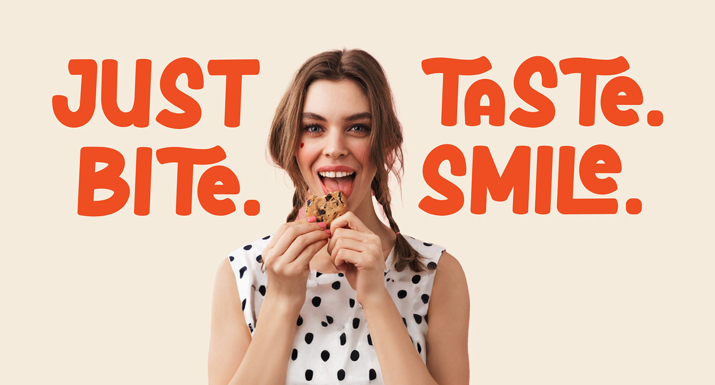
Tagline: "Snookies: Bite-Sized Smiles for Big Grins!" (with the "oo" used for a smile)
Outcomes:
The new brand identity and packaging design create a cohesive and memorable brand experience.
The visuals effectively communicate Snookies' core values of happiness, deliciousness, and sharing.
The packaging design is visually appealing and shelf-friendly, attracting consumers in a competitive market.
Overall, the Snookies brand identity and packaging design are designed to make every bite a smile.